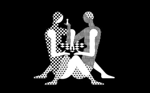
Checkmating: 2018 World Chess Championships logo evokes a sexual position
January 9th, 2018

What comes to mind when you think of chess? Quiet intensity, tactics and combinations, predicting the opponent’s next move, the ultimate battle of wits? If you said “steaming hot sex”, either you have a very interesting fetish or you are the designer of the logo for the 2018 World Chess Championships in London. Maybe both.
Designed by the Moscow-based studio Shuka Design and compared by many to a Kama Sutra position, this “pawnographic” logo would feel right at home on our list of the most sexually suggestive logos. Some critics have even claimed it’s not safe for kids to view. World Chess’ claim that the logo is "controversial and trendy, just like the host city" is not exactly pulling wool over anyone’s eyes. A commentator on World Chess’ official unveiling page for the logo hits the nail on the head with this acerbic remark: “‘Controversial & Trendy’ is code in the design world for ‘We paid up front and got a hot mess of garbage and now have no money or time to have someone with talent to redo it’.”

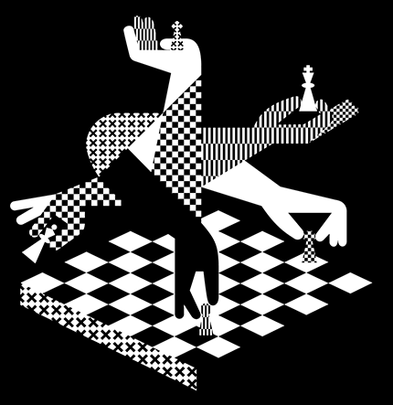
This alternate logo, on the other hand, is still modern and unique without being unduly provocative. This is much more in line with what you might expect a “controversial and trendy” logo to look like, going by typical “chess tournament” levels of controversy (rather tame, really).
Still, the strange logo has its share of defenders who applaud its daring design. And going by the philosophy that “no publicity is bad publicity”, one could certainly say that it has attracted a lot of interest for a normally underrated sport.
Besides, if nothing else, this logo can be used as an effective test to determine whether you are a true fan of the “game of kings”. The answer is “yes” if, when asked what’s wrong with this logo, you reply “the chess board is only six by six squares.”
About the Author:
Daniil Stoenko is a professional writer and translator who produced a variety of articles for LogoBee’s Logo Design Blog over the years.


