Home> Famous Brands

Sport Team Logo Design In 2021

July 22nd, 2021

When it comes to a sports team’s branding, the logo is the most critical element. In addition to being at the very heart of brand recognition, it can also help build an audience – or, in the case of a sports team, a fan following. The logo demonstrates   a team’s fundamental values and helps set the team apart from the competition, providing supporters with a powerful symbol to identify with and rally around. These logos must be easy to recognize and striking in any format, be it on jerseys and helmets, on and around a sport field or upon the tv screen. Sport teams update their logos frequently to remain up to date and attractive to fans.

With that in mind, let us take a look at some of the logos to have recently been unveiled as teams seek to follow the design trends of this new year. These logo designs may serve you as sources of inspiration in creating your own perfect sports team logo


1. Political correctness is the new name of the game

While teams modifying their logos and company names to remove racist elements and other unfortunate holdovers of years past is not new, this trend has really picked up steam following the advent of the Black Lives Matter movement. It can, however, be a challenge for a team to change its design identity without losing the elements that resonate with its fans.
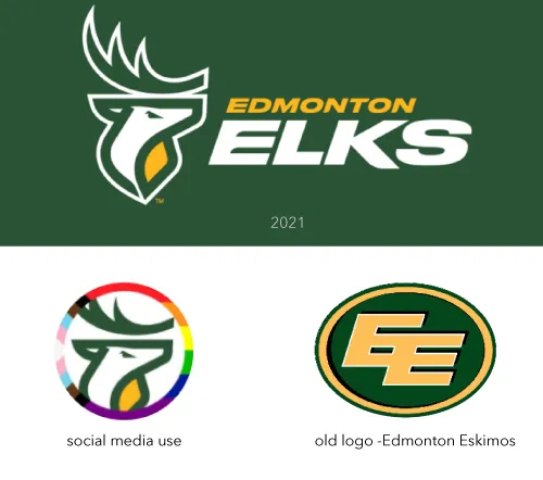
 

The Edmonton Elks is the new name of the CFL team formerly known as the “Edmonton Eskimos”, keeping the iconic initials “EE”. The designers created a modern elk symbol and used the letter “E” from their old logo.


Read the rest of this entry »

BMW Logo Update and current trend in a logo design

March 4th, 2020


BMW just announced it`s new logo design update. As it seems they follow the common trend in a logo design industry. Simple, Geometric, 1-2 colors design. I personally appreciate such design. From a designer point of view, this style somewhat limits the creative ability to design new and exiting logo styles and ideas. As many brands will follow in the same creative direction, it will be hard to come with more and more new geometric and simple designs. As a designer myself with over 25 years of experience in a logo design industry I may say creating a simple and original logo is way more difficult than it may seems. For once you cannot repeat someone else’s design and the challenge of creating a new simple geometric shape is incredible. But as always creativity is limitless and always looking forward for the new trend.


Read the rest of this entry »

Logo design trends to look out for in 2020

October 15th, 2019

A logo isn’t just a small image you add to your website header for the sake of filling in a blank space. A logo is a crucial branding element that helps your business stand out and encompasses in a few pixels the essence of your products and services. Looking back at the history and evolution of logo design, many trends have come and gone and brands have learned to adapt. Now that 2020 is almost here, it’s time to look at the most interesting logo design trends and see how you can revamp your old logo to keep up with competitors.


Adaptive logo design

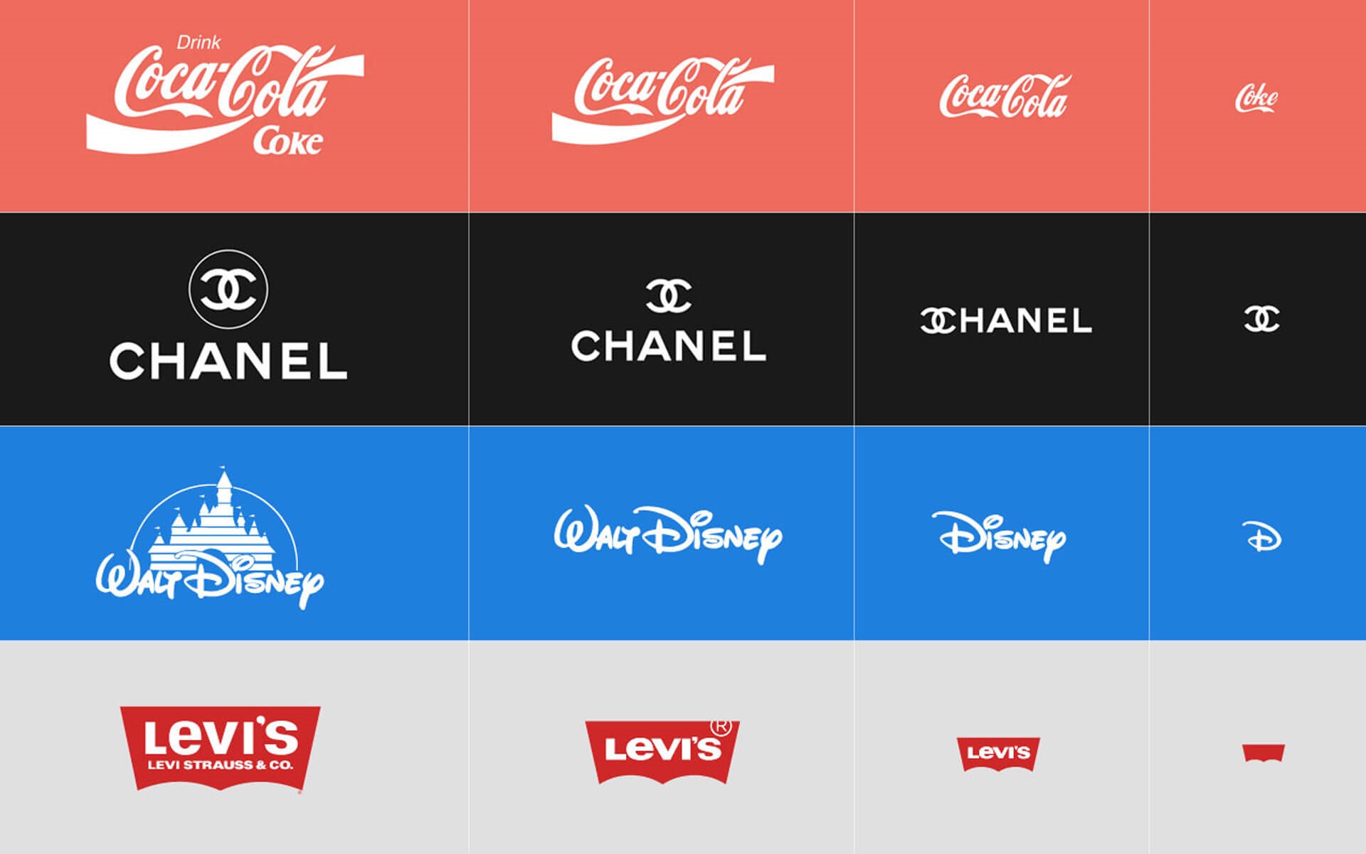
Like web design, logo design needs to be chosen depending on the device that people use to view your website. According to a TechJury analysis, there will be 2.87 billion smartphone users in 2020. Moreover, 63% of smartphone users have made at least one purchase at their device and use it to interact with brands. Naturally, your logo has to be optimized for mobile users, but does this mean that you should neglect all other platforms? Not at all. Adaptive logo design is one of the trends that marketers have been looking forward to the most, because it allows you to use different versions of a logo, depending on the device of the end-user.


For example, here’s how these famous brands optimize their logo from desktop to mobile:

Source: diony.co.uk

Read the rest of this entry »

Logo plagiarism: the devil is in the details

March 29th, 2017

Logo design plagiarism controversies are one of the most common topics our blog deals with. However, even as we defend some designers and accuse others, you may have noticed that we have never approached things from a purely legal perspective. Why?

Read the rest of this entry »

How simple is too simple in logo design

January 26th, 2017

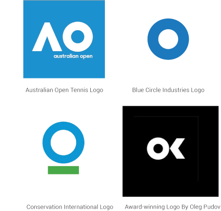
If you are a fan of tennis, you are probably following the Australian Open, and if so, you may have noticed that just about everyone, aside from Federer, seems to be wearing the same Nike outfit for whatever reason, right down to the sneakers! Not exactly convenient for telling one athlete from the other. How funny that the logo for the tournament should suffer from the exact same issue as well?


The updated logo of the Australian Open has made very few fans so far. According to a poll conducted by The Huffington Post Australia, 66 percent of respondents prefer the old logo over the new one. The overwhelming opinion is that the replacement simply fails to convey the essence of the tournament as well as the old logo – depicting a tennis player in the glare of the scorching Australian sun – did.

Read the rest of this entry »

Meetup's new logo: Beyond the nametag

October 5th, 2016


Read the rest of this entry »

Netflix's New Logo: Double Trouble?

June 28th, 2016


Seems like the lion’s share of the articles in our blog consists of a) companies replacing their iconic logos by more app -friendly ones (usually to the great displeasure of the public) and b) logo design plagiarism controversies. So today, as a special treat, we’re covering a case that merges both! Except the logo is not actually being replaced. And there’s not really a plagiarism controversy. Don’t worry, it will all become clear in a moment.

Read the rest of this entry »

In with the old logo design?

June 2nd, 2016

New old logo

As you may have noticed, rebranding is a common topic in this blog. Updating a logo to a more modern one is a common practice – everyone wants to be up to date and with the flow. But The Co-operative Group, also known as the Co-op, chose to take the road less traveled by instead reinstating a previous logo of theirs – one that is almost 50 years old!


Read the rest of this entry »

Insta Indignation

May 17th, 2016


A couple of months ago we have talked about how Larry the Twitter bird has been turned from a mascot-style logo into a flat monochrome shape over the years, and concluded that the simplification was all but inevitable in today’s design environment. Now, we have been proven right.

Read the rest of this entry »

Coca-Cola Comparable Cans Cause Controversy

May 3rd, 2016


Red is Original. Silver is Diet/Light. Black is Zero Sugar. Green is Life. That’s how it has always been… but soon, it shall no longer be so.

Read the rest of this entry »

Cooler and Controversial logo design

April 5th, 2016

Does Rhode Island’s new logo, created by acclaimed designer Milton Glaser, really pale before this replacement created by local designer in 10 minutes?


New Rhode Island logo created by Milton Glaser


Read the rest of this entry »

Double Entendre

March 29th, 2016

Tesla uses a logo with a double meaning to get around branding issue that prevented them from spelling out the word “sex” with the names of their new car models. Yes, really.


Read the rest of this entry »

Twitter logo transformation

March 23rd, 2016

The changes underwent by Twitter’s bird logo demonstrate the popularity of cleaner, simpler logos in this day and age.


The famous (or infamous, depending on how you look at it) social media site Twitter is celebrating its tenth birthday. Over its ten years of existence, Twitter has gone through a multitude of logos. We have discussed some of them before, but very little weight in the article was given to the main attraction: Larry the Twitter bird itself, which has undergone some interesting changes over the course of its existence. This article aims to correct the oversight.

Read the rest of this entry »

Magnolia Mania Logo

March 22nd, 2016

Palm Beach jeweler accuses actress Reese Witherspoon of plagiarizing her Magnolia Collection’s logo and using it for her clothing line Draper James.


Here we go again.

Like so many times before, the topic of the day is logo design plagiarism, or accusations thereof. This time, actress and producer Reese Witherspoon has come under fire for the logo of her clothing line, Draper James, which Jordann Weingartner, founder of the company I Love Jewelry, claims to be a copy of the logo she created for her Magnolia Collection.

The jeweler certainly does not mince her words, saying that Witherspoon “literally stole [her] magnolia”. While it’s hard to deny a resemblance between the two logos – both flower shapes with six petals and calligraphic initials in the center – Weingartner’s claims about the logo being her “artistic take on a magnolia” which “actually looks nothing like a magnolia” are slightly harder to swallow: viewed from above, these flowers can indeed have a very similar shape, thus the resemblance could potentially be coincidental. As we have said earlier on this blog, determining whether your logo has been plagiarized or simply inadvertently recreated by someone else is very difficult unless the logo in question has a very distinctive shape.

How ironic that the beautiful magnolia flower, often seen as a symbol of nobility and purity, would become the centerpiece of such a massive scandal.


About the Author:

Daniil Stoenko is a professional writer and translator who produced a variety of articles for LogoBee’s Logo Design Blog over the years.

Read the rest of this entry »

55 Olympic Games Logo Designs Since 1896

December 21st, 2015

This is complete collection of 55 Olympic games logos and graphics SINCE 1896.


55 olympic  games logos


Read the rest of this entry »