Freudian slip-ups: the most sexually suggestive logos
December 20th, 2016
If father of psychoanalysis Sigmund Freud is to be believed, the human mind revolves mostly around sex. Looking at some of the logos on today’s list, it’s easy to see where he was coming from – no pun intended. None of them have been created for companies that deal in sexually explicit goods and services, yet they look like they might as well have been. Whether their designers’ sexual urges and frustrations drove them to subconsciously draw genitalia or whether the viewers’ perverted minds caused the misinterpretation of completely innocent designs matters little – one way or another, one they still prove Freud was right.
A word of warning: this article does contain some suggestive imagery and potentially inadequate language, and may be considered mildly NSFW depending on the standards of your workplace.
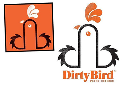
Possibly the king of all sexually suggestive logos, created for a catering company called Dirty Bird. The logo designers said they “worked with the lowercase 'db' linking them to form the shape of a rooster”. The clients are not as certain, especially taking into account the fact that the company has also come up with posters asking customers to 'Touch My Thigh' and 'Touch My Breast'.
“It depends on how you look at it,” designer Mark James says. But no matter how one looks at it, the logo for Dirty Bird is still one… big… cock.
…I sincerely apologize for that one. I’ll see myself out.
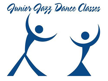
The other gender is not left out, either. This incredible logo for dance classes is meant to depict a couple dancing, but people were quick to notice that an optical illusion made it look like… something else entirely. As is the case with many optical illusions, the solid colors tell one story, but combined with the white space between them, a completely different picture emerges, one that makes one wonder exactly what sort of “dances” these classes teach, particularly to juniors!
Accommodation listings website Airbnb once had an entire Tumblr account dedicated to making fun of their logo. For once, claims that it was plagiarizing another company – Automation Anywhere – were not the worst complaint leveled at a logo. The funny thing about this logo is that, while just about everybody can find something offensive in it, there is no clear consensus as to what exactly it resembles. Is it a scrotum? Breasts? A vagina? All of them? “I challenge you to name a sexual area not evoked by the Airbnb logo,” one Tweeter user throws down the gauntlet. To date, no one has managed to answer the challenge. Gizmodo calls the logo “the sexual Rorschach test for our time”.

Sometimes, a logo will go beyond just resembling genital organs and into even more dangerous territory. This logo, created for the care organization Arlington Pediatric Center in 2009, had to be scrapped when observers pointed out that the position of the kid in relation to the adult was making them out to be in a rather unorthodox position. And on that topic...

This logo was designed in 1973 for the Catholic Church’s Archdiocesan Youth Commission, and there are really no words for it but what the hell? The infamy catholic priests have acquired for often getting just a little too touchy-feely with youths is what really makes this logo extra heinous. The most shocking thing, however, is that it apparently won an award from the Art Directors Club of Los Angeles!
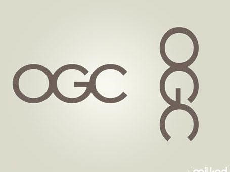
The United Kingdom’s Office of Government Commerce (OGC) had to scrap this logo in 2008 when some people pointed out the way it looks when flipped onto its side. A spokesman for OGC told the Telegraph: “on consideration we concluded that the effect was generic to the particular combination of the letters OGC – and it is not inappropriate to an organisation that’s looking to have a firm grip on Government spend.” While one has to applaud them for being able to make fun of themselves and their little… boner, some might argue that the actual effect of the logo is depicting the OGC as a bunch of, dare we say, jerk-offs?
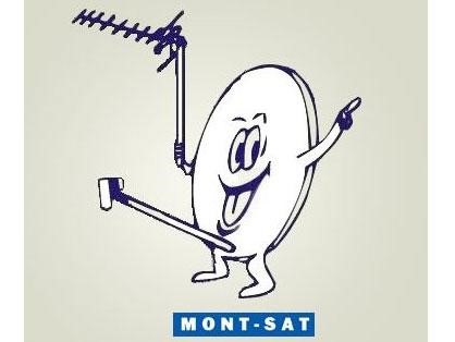
This logo for a Polish satellite company is one of the few on this page that have not been changed despite their suggestive nature. The cowardly way out is clearly not Mont-Sat’s style – they bought this logo, and they’re sure as hell going to use it, phallic innuendoes be damned. To this day, the logo can be seen on their site, displayed as proudly as the erect transmitter donger their mascot shows for all to see.

Their "secret ingredient" is secret for a very good reason.
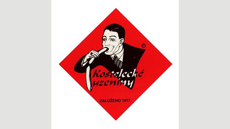
According to this Czech sausage company, their logo represents “quality in all its dimensions, elegance and joy in everyday life”. We don’t think anyone but them needs help figuring out what it ends up symbolizing in practice. Sausages are phallic enough as they are, did they really need to turn that aspect up to eleven in the logo?
According to this Czech sausage company, their logo represents “quality in all its dimensions, elegance and joy in everyday life”. We don’t think anyone but them needs help figuring out what it ends up symbolizing in practice. Sausages are phallic enough as they are, did they really need to turn that aspect up to eleven in the logo?

This logo, created for the The Institute of Oriental Studies, of the University of Santa Catarina, was supposed to be depicting a pagoda in front of the rising sun. Yeah… the only thing “rising” in this logo is the “pagoda” itself, boldly reaching not towards the sun, but deep into the one place where the sun don’t shine. Unsurprisingly, the logo was promptly withdrawn.

We get that sexy doctors and sexy nurses have been a running theme in pornography since forever, but… sexy dentists? As far as medical practice goes, dentistry is probably one of the least sexy branches. Dentistry is scary. Going to the dentist is the terror of children everywhere. Having someone tinker about in your mouth with sharp implements is not exactly what most would call arousing, though we suppose there might be a fetish for that, too.


