IKEA logo concept makes perfect sense
December 4th, 2015The logo of everyone’s favorite Swedish flat-packed furniture retailer has changed very little since 1967. Though once-upon-a-time black and white, and for a short time red and white, the familiar blue workmark inside a yellow oval has been IKEA’s trademark since 1983.
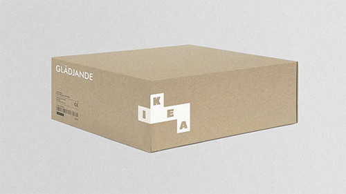
But Scottish design firm Freytag Anderson thought it was time for a rebrand. In a recent issue of Icon Magazine, the design firm showcased its ideas for a new Ikea branding concept – and you know what? It makes perfect sense.
Posted in: Famous Brands, Logo Design,
