When sports logo design goes wrong
July 12th, 2017

The importance of any logo is impossible to overstate, but sports teams’ logos are in a league of their own. Just think of all the places they appear: the players’ uniforms, memorabilia sold to fans, the team’s home stadium, live on air during televised matches, and so on. A company getting a bad logo is always an unfortunate event at the very least, but a sports team getting a bad logo is nothing short of a catastrophe. This does not stop teams from occasionally ending up with some real stinkers.
Deciding that its handlebar-mustached, lantern-jawed mascot was getting a little dated, the University of Nevada, Las Vegas, unveiled last Wednesday a new logo which has been universally panned. The confused fans have found themselves unable to make heads or tails of the new logo, and with good reason. Careful examination does reveal the shadow of a mustached face under a wide-brimmed hat, but logos should stand out at first glance, not after you take 5 minutes to try and make sense of what you’re seeing. Particularly confusing is the star, which instantaneously catches the eye and leads the observer’s gaze away from the actual face. The viewer might even be tempted to assume the star is supposed to represent an eye (like in the Minnesota Wild’s far superior logo), but no – the star is, for all intents and purposes, a red herring.
Not helping matters at all is the logo’s $50, 000 price tag. One would think a university, of all institutions, would know better than to spend a large chunk of its budget on this abomination.
Nevertheless, as awkward as it may be, the UNLV’s new logo is far from being the worst sports logo of all time, as demonstrated by the following disasterpieces…
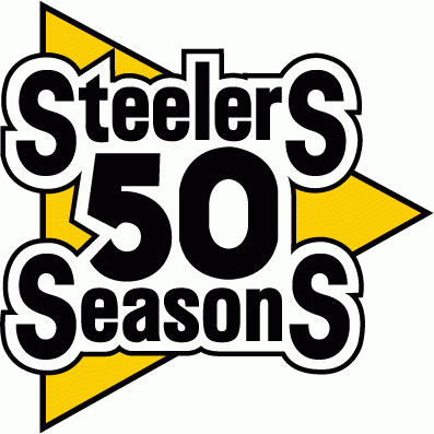
Made for the Pittsburg Steelers’ 50eth anniversary in 1982, this logo looks awkward and does not represent the team whatsoever and seems particularly intent on shoving the letter “s” at the start and the end of “Steelers” and “Seasons” in our face for some reason. Not to mention that it looks like a title card for the worst sitcom of all time – watch out, Two And A Half Men, you’ve got competition!
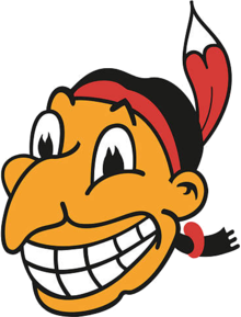
Throughout this article, you’ll notice that a lot of the worst sports logos are mascot-based. Mascots tread a perilous edge: being funny without becoming ridiculous. Not all succeed. Some accidentally slip and fall to their demise. Chief Wahoo, on the other hand, throws himself into the abyss of ridicule head-first, most likely shouting “GERONIMO!”
The very existence of the Cleveland Indians’ mascot is somewhat of a cultural catastrophe, but this instance of the character, used from 1946 to 1950, is extra heinous.
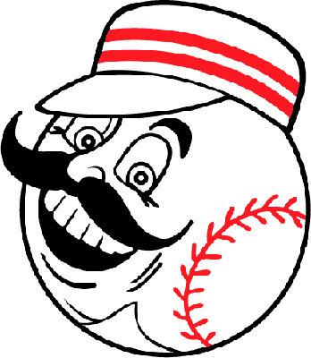
This is an alternate logo that the Cincinnati Reds used for about 5 years, and you absolutely cannot convince me that this thing is not going to stalk me to my home at night and murder my entire family with creative baseball-related methods. How is there no horror movie with this premise yet? You could call it “Last Base” or maybe “The Cincinnati Sinner.” The plot’s practically writing itself!
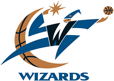
No, Washington Wizards’ logo designer, you are no Pablo Picasso, nor will you ever be. It’s hard to say what’s the most hilarious thing about this logo: the way the wizard’s beard bifurcates to make his body into a W shape, the basketball-colored half-moon, or the fact that this wise and ancient archmagi seems to have decided that the best application of his unlimited arcane power that defies the laws of reality is the mighty spell known as the “Finger Roll”.
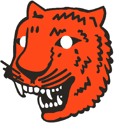
“Well, I could hire a professional logo designer to create a new logo for the Detroit Tigers, or I could take that doodle of a tiger that my 3-years-old son drew in 5 minutes in MS Paint, and be done with it... Tough call.”
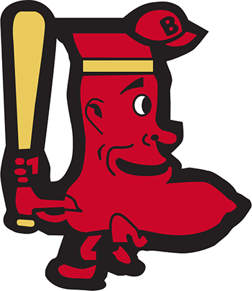
“We’re the Boston Red Sox, right? Clearly, our mascot should be a red sock. Wearing a baseball cap. Playing baseball.” Exactly how much crack cocaine was involved in the creation of this sports icon? We may never know, but our educated guess is “all of it.”
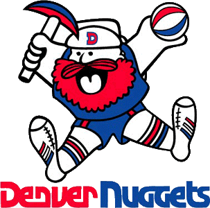
Apparently, somewhere in-between digging deep into the heart of Mount Moria for gold and waking up Balrogs by accident, the ancient dwarves of legend still find the time to play some basketball. Can’t really blame them, after all, what sport could be better suited for their short and stout frames, aside from literally every single other sport ever?
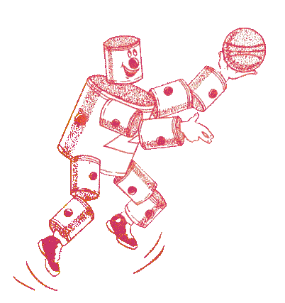
Move over, Iron Man! Crime has a new enemy! Armed with his trusty basketball, he patrols the city streets, and evildoers fall over themselves with laughter when they hear his inexorable, clanging approach! He is… The Unimpressive Tin Can Man!
This is actually an old logo/mascot used by the Detroit Pistons, known as the Fort Wayne Zollner Pistons back then, and this unfortunate golem consists of pistons, not tin cans, which makes it maybe 5% less pathetic. At best.
Say what you will about the above logos, but at least they weren’t boring. In the modern world, logos are typically more professional-looking – but they often lack much in the way of substance or personality. Entertainingly terrible logos have been replaced by merely underwhelming and forgettable ones. Why would a team named the Chicago Bears have this for a logo?
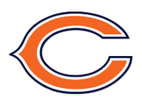
The terrible sports logos of yesteryear may make us laugh nowadays, but at least we remember them. And in a way, you could say that means they did their job well enough.
About the Author:
Daniil Stoenko is a professional writer and translator who produced a variety of articles for LogoBee’s Logo Design Blog over the years.


