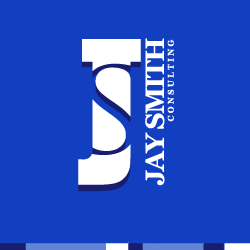
Company Name: Jay Smith Consulting

Description
The typography-based logo is simple, clean, and professional, as Jay requested. It balances between traditional and contemporary by using a classic-style serif font and then rotating it for a modern twist. The emblem, likewise, balances between polished and edgy in the way the thin “S†shape is cut out of the bold slab-serif “Jâ€.
